Display The Data With Plotly
We can use the command line interface to the Perl script to create nice HTML charts to display the results.
perl bin\city_covid_data.pl -h
USAGE: city_covid_data.pl [-h] [long options ...]

    -n --create_new_zcta_db     Create a new NYC Zip Cumulative Test 'A'
                                JSON db for todays result
    --show_zip_stats=[Strings]  Get the available statistics of a given zip
                                code or codes
    -v --verbose                Print details
    -c --write_zcta_to_csv      Print latest ZCTA data to csv, 'output/
                                all_zcta_data.csv'

    --usage                     show a short help message
    -h                          show a compact help message
    --help                      show a long help message
    --man                       show the manual
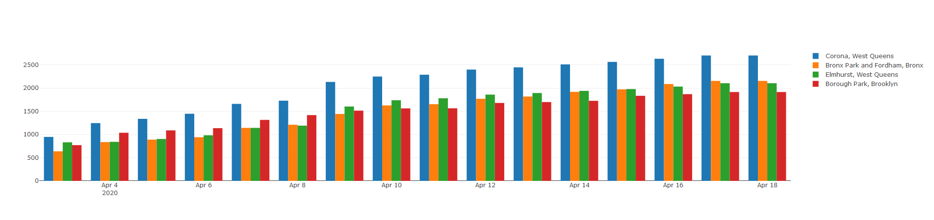
perl bin\city_covid_data.pl --show_zip_stats 11368,10467,11373,11219
The example here displays the test results for 4 New York City zip codes that happen to have the highest incidents of positive test results. To help display the results in a graphical way, I found this great Perl module, Chart::Plotly and Chart::Plotly::Trace::Bar , which is a Perl interface to the Plotly JavaScript library.
sub show_stats_for_zips {
    my ( $self, $zip_codes ) = @_;

    my @chart_names = ref($zip_codes) eq 'ARRAY' ? @{$zip_codes} : ($zip_codes);
    my $date_conv_func   = $self->date_to_str_func();
    my $stats_cache_func = _get_zip_chart_stats_cache_func();

    my @charts;
    for my $zip_code (@chart_names) {
        my $zip_code_stats = $stats_cache_func->( $self, $zip_code );
        my $chart = Chart::Plotly::Trace::Bar->new(
            x => [
                map { $date_conv_func->($_) }
                  @{ $zip_code_stats->{dates} || [] }
            ],
            y => [ @{ $zip_code_stats->{positive} || [] } ],
            name => $self->city_district($zip_code),
            text => $zip_code,
        );
        push @charts, $chart;
    }

    my $bar_chart = Chart::Plotly::Plot->new(
        traces => [@charts],
        layout => { barmode => 'group' }
    );

    Chart::Plotly::show_plot($bar_chart);
}
You can download the HTML chart below.
The results are displayed in a nice HTML file with the Plotly chart.
The code: https://github.com/aibistin/covid